"Coup de grace" in Denton County, TX 2020: "y=+b"
"Coup de grace" in Denton County, TX 2020: "y=+b"
And I do mean coup. And yes, the mx terms of the y=mx+b line equation are null LOL

CRITICAL: After you finish this, you will find the answers in my “Dissecting Denton’s Disaster” post.
NOTE: I have made this my new pinned post but you need to go read my previous pinned post about Pasco County, FL as soon as you finish this to fill in context if you are new to my series.
First the chart. Here endeth my stealth “(vote) signal processing for dummies” class first lecture:
First of all, the Trump (red) and Biden (blue) incremental vote lines are actually flat lines with some added noise which we will go into the explication of shortly. So you can now pause and take a deep breath since you have already intuitively figured out what this means no matter how little math background you have. (Hint: a-l-g-o-s)
The only question you have at this point is: But Trump won?
The answer to that is that Denton County is part of the deep red northern Dallas metro, near to Oklahoma part of Texas — so a Trump loss there would have been a bridge WAY too far. So instead of a 60-70%+ Trump win or whatever it was in reality, the machine programmers decided (perhaps accidentally or in a programming rush) that the answer was flat lines at 53% Trump and 45% Biden since nobody would be accepting a “too close to call suspense” 51/49 for an answer here either LOL. AND: These lines were drawn by the algo in of all things a 1.83:1 ballot framework as exhibited by the purple missing vote records line up above 800 (rather than just below 1000 as in Clark County, NV for instance). The missing presidential votes here were in the form of varying CVR number counting gaps (like Clark and SF Counties) rather than the blanking of upper ballot races as is the more common case like in Denver. Dropping below 2:1 makes sense where ballot stuffing is harder like it probably is in very red Denton and this is the first sub-2.0 ratio I have seen. The first >2 ratio I saw was 3:1 in Denver.
Regarding this ballot framework ratio of 1:83:1, the big picture is that in Denton County the 2020 population was ~900K and the total presidential vote was ~420K with ~410K of that to Trump and Biden. Not only does this not seem like a high percentage of the population voted, it seems crazy low in a place where any Republican related thing that could be dragged around at all probably voted! That’s where the 1.83:1 ballot framework (all they could manage) comes in to play — you can’t draw lines this straight without carefully selecting which votes will be used because … wait for it … the ending CVR number in the CVR file is … if you’ve been reading the series you know this is coming … 771,467!
And of course that ~420K mentioned earlier is actually 420,511 rows in the file that were actually counted according to CSViewer.
That’s how you have the ammo to draw straight lines.
And y=mx+b without the mx? y=mx+b is the equation for a line and if you drop the mx then it’s a perfectly flat line which is what we have here. As I go, you will see that it is so flat that it “breaks” the operation of the standard python library linear trend curve fitting code that I apply in these charts. Perfectly flat lines don’t happen in nature.
The rest of this post is more detailed proof including some surprise “(vote) signal processing for dummies” — but rational people have all you need to know that this point and can stop reading if your math tolerance has already been exhausted.
Signal processing?
What I have really been doing in this series is conducting a stealth “signal processing for dummies” course without ever mentioning the words “signal processing” in the series to date. And it applies to proving how flat the “vote signal” in Denton is as I will go through. This is actually not hard for those of you who have decided to stick around. And for an added bonus, at the end I will throw up a new “heatmap” chart type for Denton that confirms that the data in the CVR file does in fact contain a mix of in person and scanned/mailed ballots by precinct which I have never encountered before but is described in this article.
On the signal processing front, you will notice that my charts contain titles with text like “incremental votes every 1000 voter records”. In signal processing terms this is a more lay friendly way to say “ low pass bandwidth” as in for example radio frequency signal bandwidth. And I haven’t talked about it but there are a few charts in my post on the Colorado primaries where the titles have “-r100-a8” in them. These are options to my charting code that set things down to “incremental votes every 100 voter records” (for smaller counties like are analyzed in that post on Colorado) and apply an 8 tap FIR “boxcar” filter (or as more people will understand, an 8 point centered moving average which is the simplest possible FIR filter).
So what happens to the Denton chart if we set to a low pass of 10,000 votes instead of the default 1,000 votes? We get this:
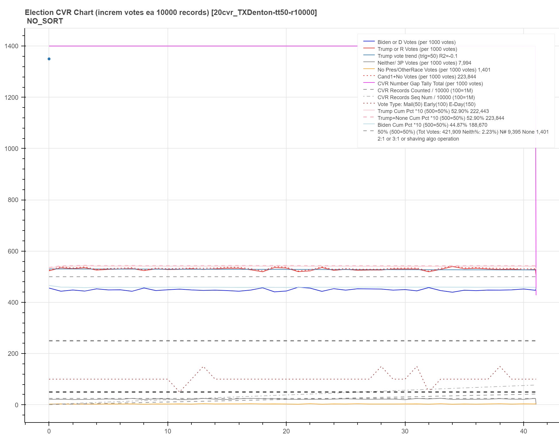
We now see even less variance from flatness in the line but it is clearly perfectly horizontal. And of all things we get an R2 linear trend match value of only 0.1 (if you go back you’ll see the first chart shows an R2 of 0.0! And if we further bump up to 100,000 votes we get this:
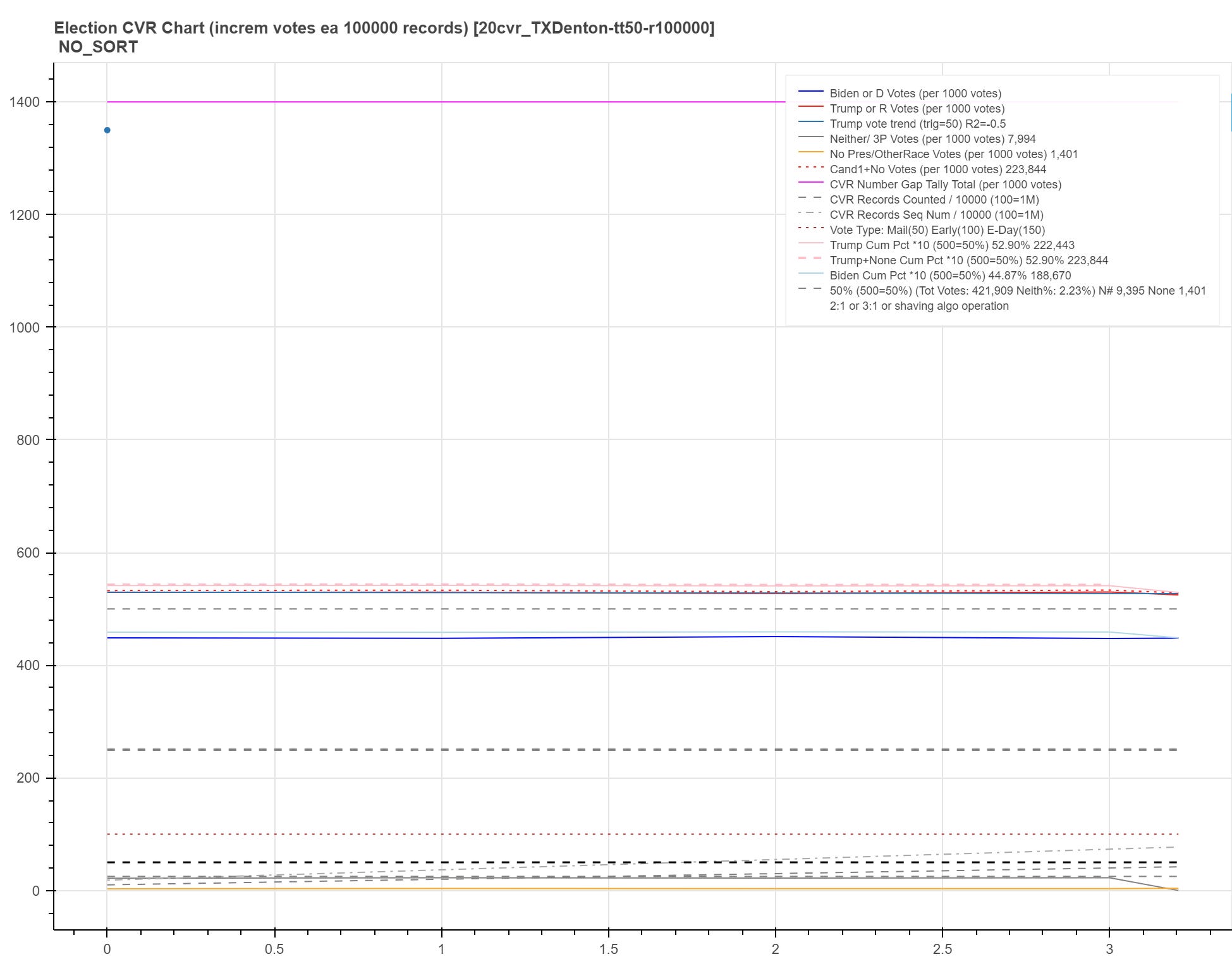
Horizontal as can be. And we see an R2 of 0.5! These wildly varying R2’s are thrown out because the standard R2 calculation library code is at its limit regarding measuring a (very, very nearly) perfectly flat horizontal line.
There, that wasn’t too painful about signal processing or curve fitting, was it? You didn’t actually learn enough to be very dangerous but many of you know more now than you did before ;)
Finally, we end with some eye candy:
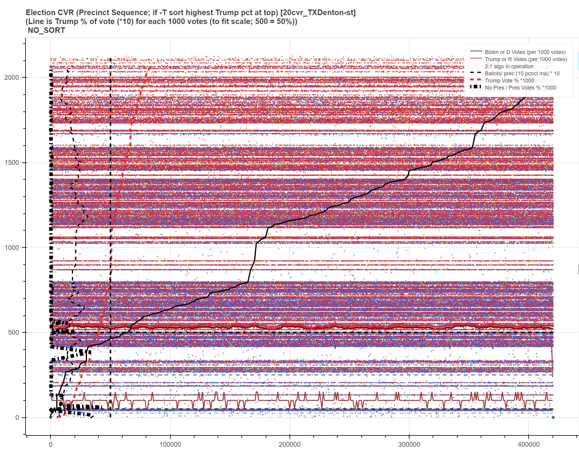
In this “heatmap” chart, the X axis (left to right) is the vote progression of R (red dots) and D (blue dots) votes during the CVR sequence. The Y axis (bottom to top) is 4 pixels/numbers per precinct with the highest percentage voting Trump precincts sorted to the top. Hence you see a color progression from bottom to top of blue(ish) to red hue!
Anyway, the killer to anyone questioning whether this is really the actual Denton County 2020 CVR file I am using is in this article. Basically, Denton is still trying to fill out their Hart voting systems consistently and some precincts have the latest and some don’t. The filled in vs sparse nature of various precincts (horizontals) reflects that fact! (I have other as yet unpublished heatmap charts that reflect the same sparse vs filled pattern only in an X axis progression back and forth between in person and mail in vote counting for instance in Pima County, AZ.)
Anyway, here is a key part of the debate in the article so it becomes more clear:
Tuesday, representatives from the local GOP arrived again, this time to speak on the potential $619,500 purchase of voting software and equipment. The money would go toward Verity software and equipment from election technology company Hart InterCivic. According to attached documents, the bulk of the cost would come from paper ballot printing units and poll pad software.
Elections Administrator Frank Phillips, at one point, explained the county needs to buy more equipment and software to make up for an increase in individual voting precincts that came as a result of last year’s redistricting. However, four GOP precinct chairs — Jean Bassinger, Cindy Hyltin, Connie Hudson and Deborah Avellano — asked commissioners to delay the purchase.
The basis for their request was that some of them had attended a recent Dallas conference focused on election integrity, called “Election Transparency on Trial.” Bassinger, who spoke first, said the event was standing room only and showed evidence of security problems with electronic voting equipment.
So there’s a cross check on my data integrity for you to close it out. If you knew what my career was you’ll know why that’s important — as well as being needed to solidify a post like this…
UPDATE: Now go read “Dissecting Denton’s Disaster” ;)