Dissecting Denton's Disaster
Dissecting Denton's Disaster
What is this flat vote carrier signal with noise *really* composed of?

(UPDATE added at end 220819am)
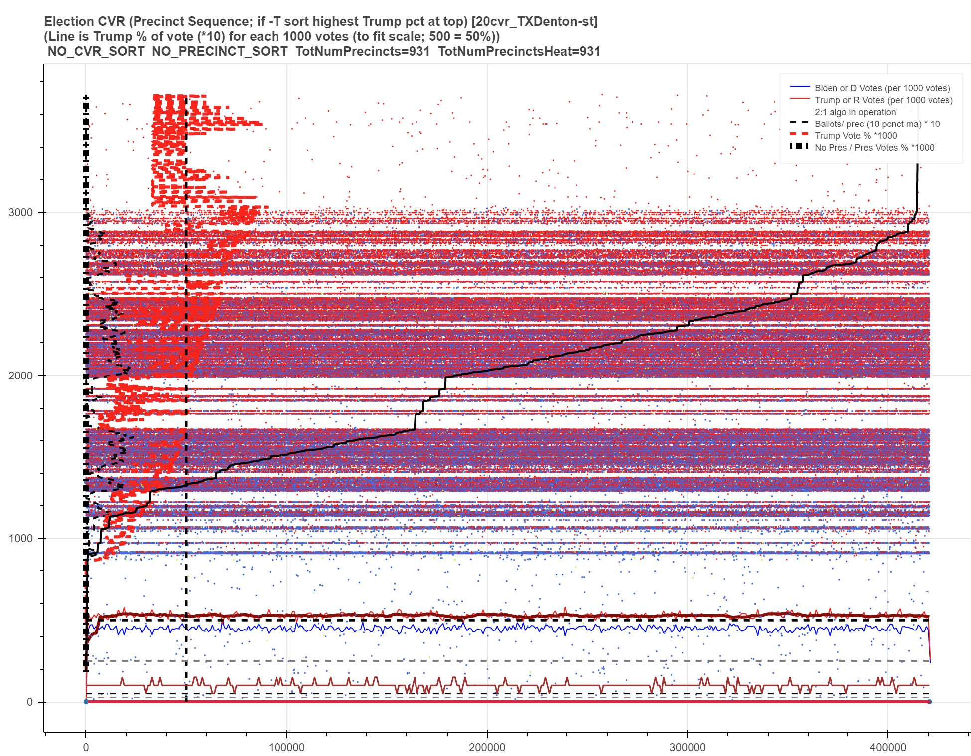
So we know that something is seriously wrong in Denton County, TX. An honest CVR file would not have CVR number gaps and would certainly not be a horizontal line with some added noise. The only argument for the latter is the law of large numbers working entirely through the US Snail as a giant card deck sorter but we are nowhere close to credibly achieving this level of flatness with 420K/970K votes unless every precinct is truly homogenous in Denton.
To that end, the answer starts to come into focus when we do a heatmap chart with the CVR records sorted by precinct instead of the published order. (Interestingly, I have found that some CVR files in CO like Larimer’s and Logan’s are actually published in precinct number sorted order rather than by column 1 CVR number as the first sort key as they should be — and BTW, Jefferson CO’s CVR file doesn’t even have a CVR number column so technically that also is a form of data fraud if you’re paying attention.)
Here it is:
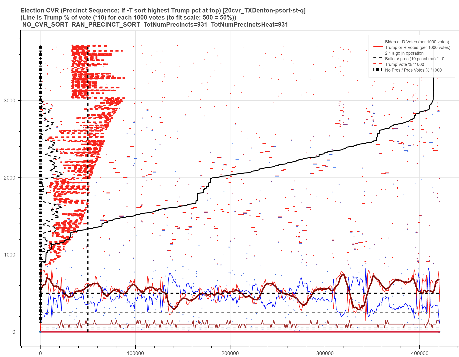
So this nails down that the flat 53% Trump carrier frequency with noise line in the last Denton post is in fact a real time or post processed attempt to scramble the actual CVR number sequence since the Trump and Biden vote percentages by precinct ARE NOT in fact all 53% (the precinct level R/D vote percentages are oscillating in red and blue as wide as 80/20ish% around the horizontal dashed black line at 500=50% that has been overlaid on the heatmap for better understanding). And this chart’s oscillation of red vs blue does make sense since there’s a moderate tendency of physically adjacent precincts (which will tend to have similar population compositions) to have adjacent precinct numbers when you look at real world precinct maps — so you would expect Dem central city and college associated precincts to stand out and the opposite for the Reps. Now Denton looks a lot less like the Twilight Zone and the machines look a lot more like a Rod Serling villian is running them.
So this confirms that the CVR numbers in the Denton file ARE NOT in fact in CVR vote sequence but are instead twice-too-cleverly in an algo randomized order which will naturally generate the 53% Trump carrier signal with fine enough algos. BUT: When they did that, at the end they managed to forget to re-number in strict 1,2,3… sequence and left the number gaps I described (like Clark and SF) which is the evidence of the framework + algo fraud! So coverup misdirection fraud + a failed coverup algo ballot framework fraud = lots of fraud.
Of additional note, I have a vertical dashed black line at 50K (=50%) for the dashed red line’s indication of Trump vote % for each precinct and you can see that trends higher (to the right) as you go up the chart since the precincts are sorted from lower Trump percentage to higher at the top. There are some interesting characteristics of the Trump % line compared to the same view of someplace like Larimer CO where the Dominion machines succeeded in their coverup (no number gaps or high percentage of missing votes in Larimer).
Here’s Larimer County, CO:

As you can see, these heatmap charts have some potential to see what is going on even in counties without full blown leaks like Larimer. For instance, while it’s possible there’s a good explanation, it’s interesting that the black diagonal vote count progress line starts to curve up vertically (makes less voting progress) as you get into higher Trump % precincts. And the dropouts in the red dashed Trump percentage lines (especially up high!) are interesting in Larimer under the Dominion machines but VERY interesting in Denton under the Hart machines!
I have more in the queue including some interesting heatmap looks at vote deletion/ missing votes especially in FL but I think this series of posts is far enough along and strong enough that a red team of election experts plus some decent python, C# or R coders could reproduce it now which really should be done at this point to build a sufficiently solid basis…
UPDATE 220819am:
Going back to looking at the standard heatmap chart (no pre-sort into precinct order clumps on the X axis) helps us understand the wild variations of the Trump % red dashed line. Needs more investigation though obviously about what is the mix of impacts of the new machine types, the re-precincting for growth itself, other unknown factors and possible fraud.